Personal Branding & Social Media
Category:
Art Installation

The Challenge
Making Content Understandable, Not Intimidating
In an industry dominated by dense terminology, technical diagrams, and insider knowledge, how do you communicate complex systems to an online audience?
The Strategy
The approach was to simplify how people enter complexity, not the complexity itself.
Instead of following the typical data aesthetic of dark dashboards, glossy gradients, and over-engineered visuals, the direction shifted toward:
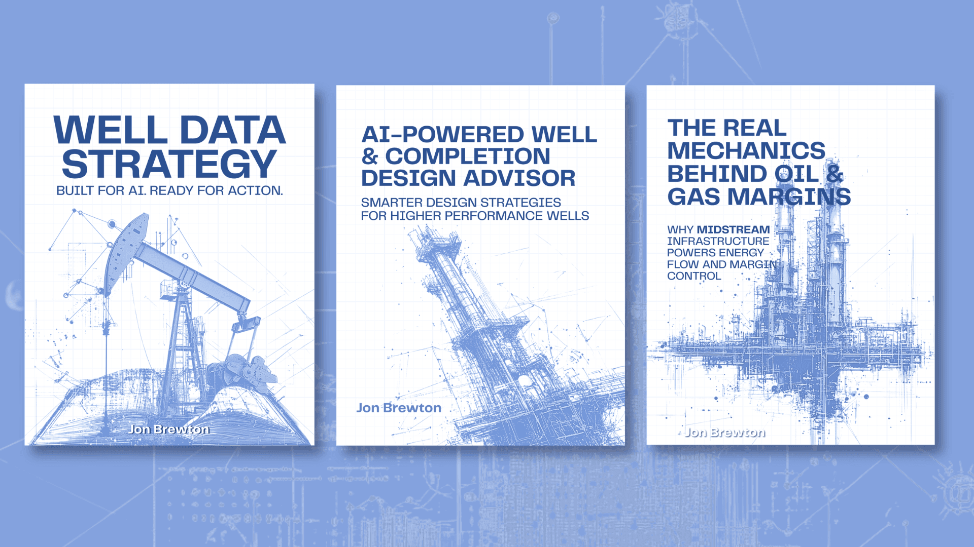
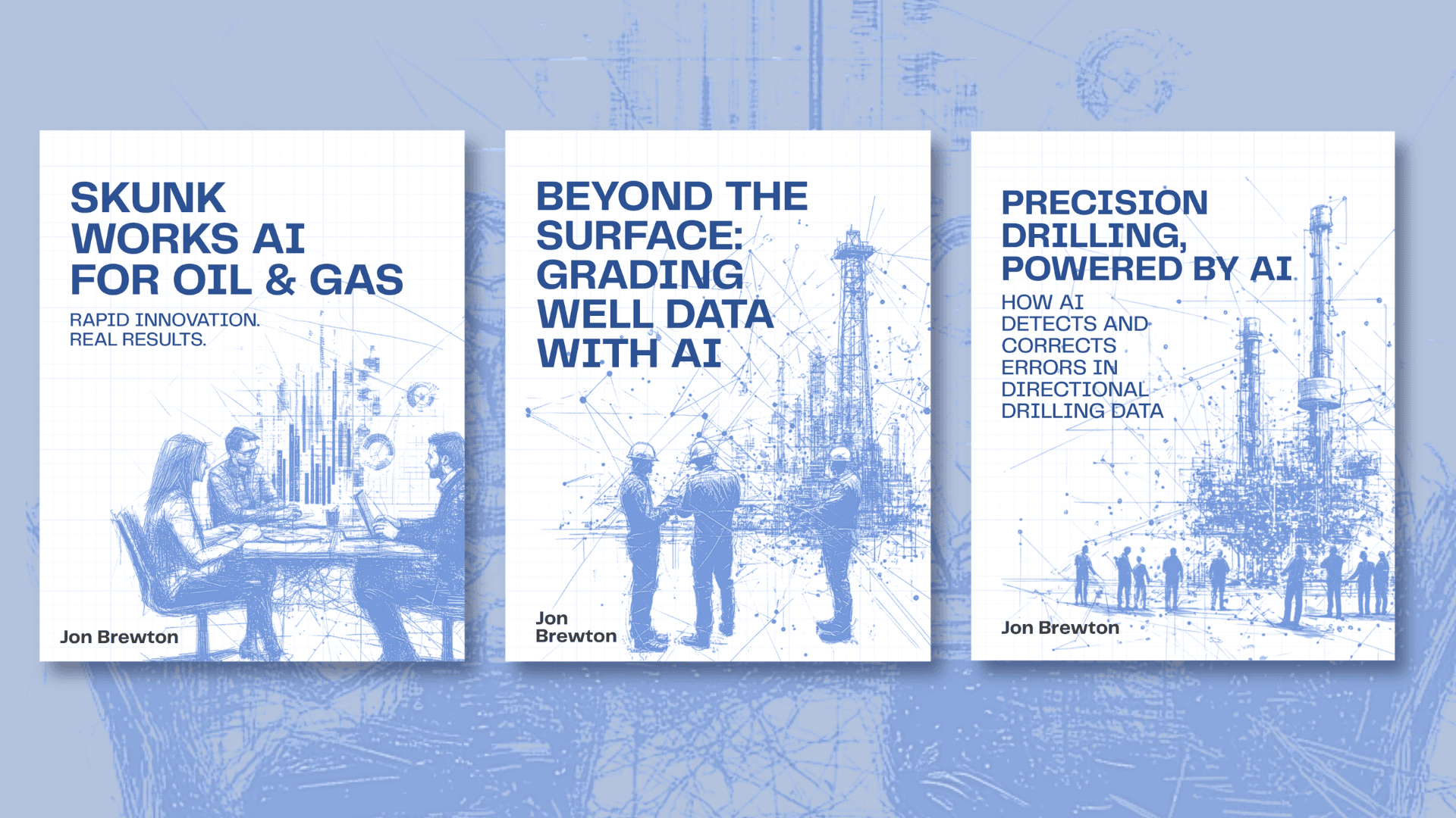
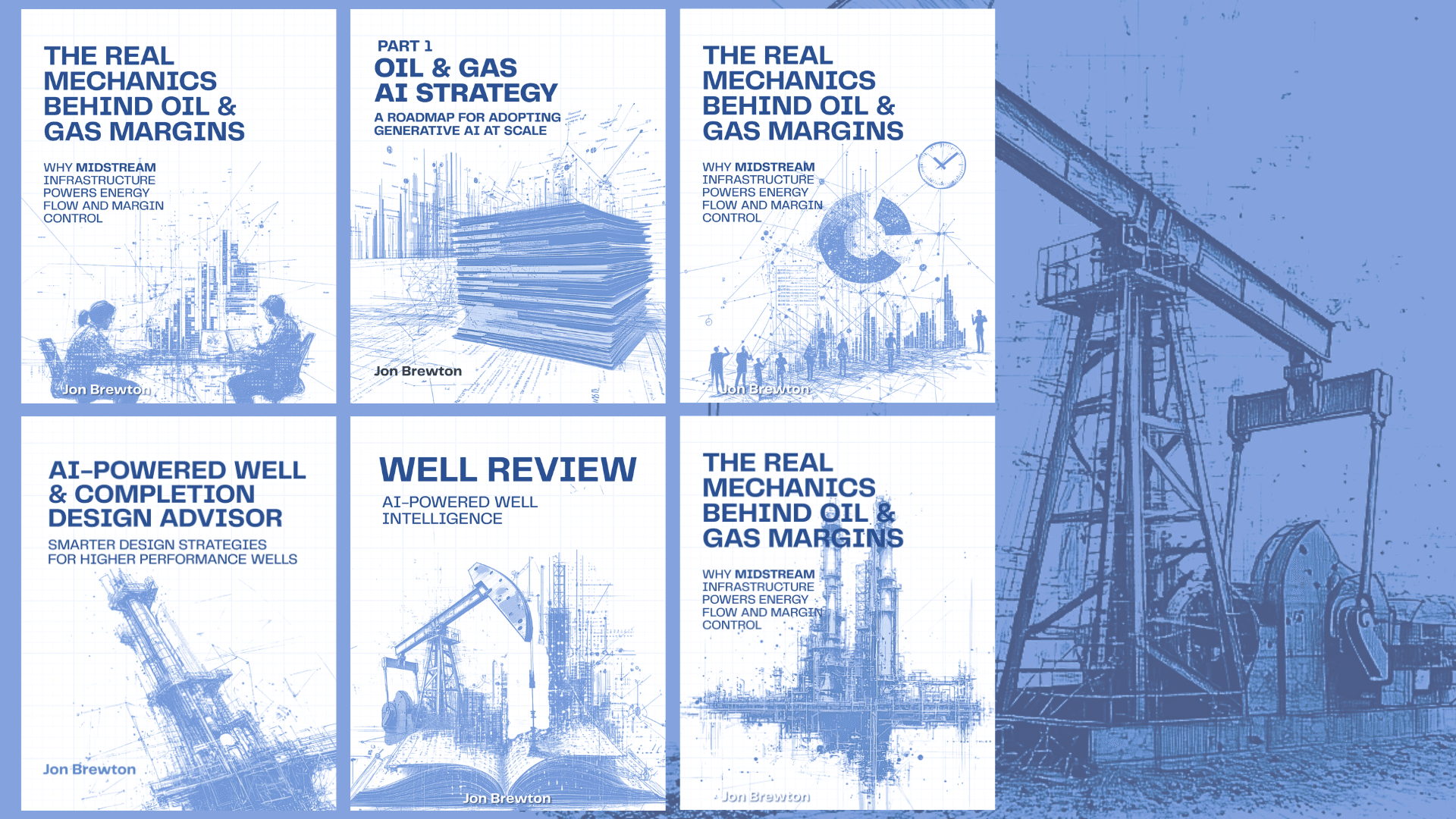
white space
pale blue tones
pencil-style sketches
This created a language that felt human, exploratory, and in progress.
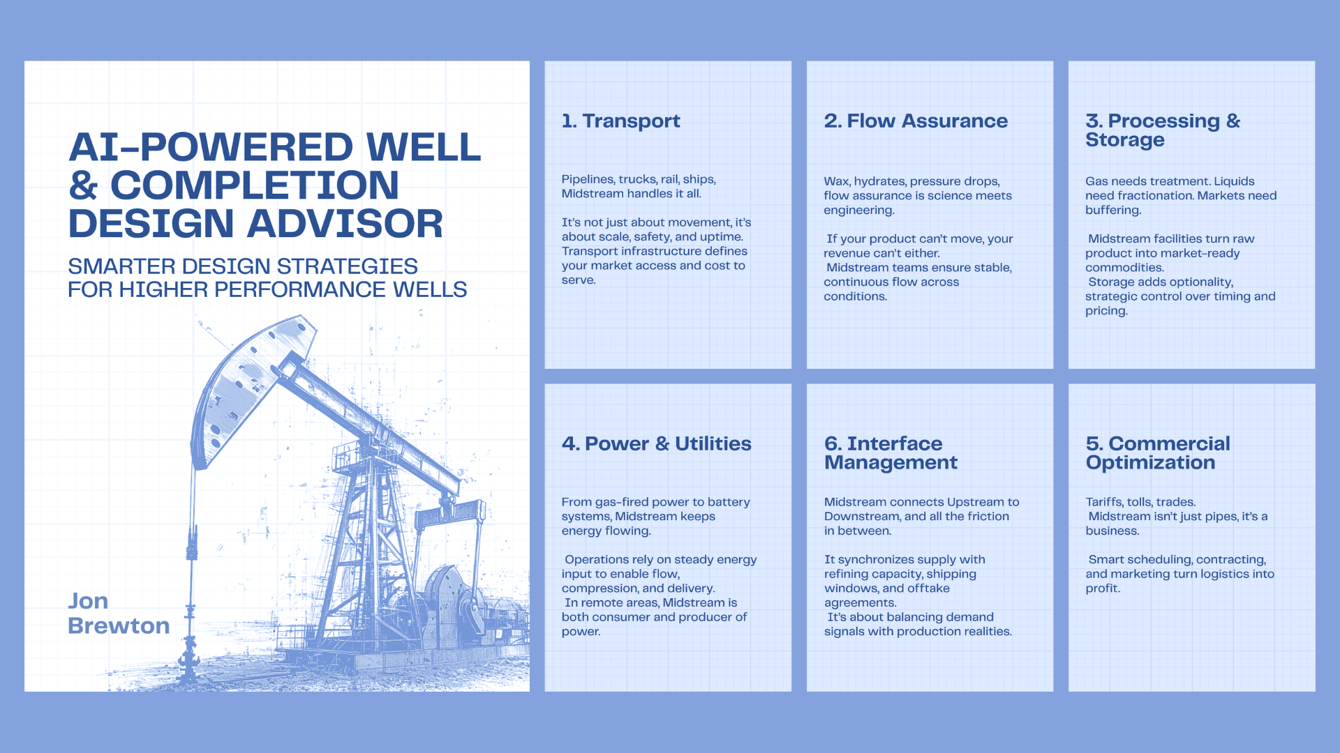
Rather than presenting full systems at once, content was broken into fragments. Each post focused on a single idea, building a larger narrative over time.
Designed for LinkedIn’s fast scroll:
A clear headline led every visual
supported by minimal, digestible context
structured for instant understanding
The Visual Language
Sketch-Based Identity
Pencil-style illustrations introduced imperfection
Referenced engineering drafts and early-stage thinking
Made complex systems feel approachable and interpretable
Color & Space
A restrained palette of white + pale blue
Grid overlays to subtly evoke systems and structure
Generous spacing to reduce cognitive load
Modular Information Design
Information broken into cards, grids, and sequences
Each unit communicated one idea clearly
Encouraged swipe-based and sequential learning
Applications
The system was deployed as a LinkedIn content series, including:
Educational carousels
Concept breakdown posts
System-level explainers
Each piece functioned independently, while contributing to a cohesive narrative ecosystem.
Impact
Established a distinct visual identity in a saturated AI/data space
Improved content accessibility and engagement
Enabled complex ideas to be understood in seconds, not minutes
Built a consistent, recognizable presence on LinkedIn
It shifted the brand from explaining complexity to making complexity feel simple
The Challenge
Making Content Understandable, Not Intimidating
In an industry dominated by dense terminology, technical diagrams, and insider knowledge, how do you communicate complex systems to an online audience?
The Strategy
The approach was to simplify how people enter complexity, not the complexity itself.
Instead of following the typical data aesthetic of dark dashboards, glossy gradients, and over-engineered visuals, the direction shifted toward:
white space
pale blue tones
pencil-style sketches
This created a language that felt human, exploratory, and in progress.
Rather than presenting full systems at once, content was broken into fragments. Each post focused on a single idea, building a larger narrative over time.
Designed for LinkedIn’s fast scroll:
A clear headline led every visual
supported by minimal, digestible context
structured for instant understanding
The Visual Language
Sketch-Based Identity
Pencil-style illustrations introduced imperfection
Referenced engineering drafts and early-stage thinking
Made complex systems feel approachable and interpretable
Color & Space
A restrained palette of white + pale blue
Grid overlays to subtly evoke systems and structure
Generous spacing to reduce cognitive load
Modular Information Design
Information broken into cards, grids, and sequences
Each unit communicated one idea clearly
Encouraged swipe-based and sequential learning
Applications
The system was deployed as a LinkedIn content series, including:
Educational carousels
Concept breakdown posts
System-level explainers
Each piece functioned independently, while contributing to a cohesive narrative ecosystem.
Impact
Established a distinct visual identity in a saturated AI/data space
Improved content accessibility and engagement
Enabled complex ideas to be understood in seconds, not minutes
Built a consistent, recognizable presence on LinkedIn
It shifted the brand from explaining complexity to making complexity feel simple


